
As an economist who writes on climate change policy, my usual stance is to stipulate the so-called “consensus” physical science (as codified for example in UN and US government reports), and show how the calls for massive carbon taxes and direct regulations still do not follow. For an example of this discrepancy that I often mention, William Nordhaus recently won the Nobel Prize for his work on climate change economics, and he calibrated his model to match what the UN’s IPCC said about various facts of physical science, such as the global temperature’s sensitivity to greenhouse gas emissions, etc. Even so, Nordhaus’ Nobel-winning work shows that governments doing nothing would be better for human welfare than trying to hit the UN’s latest goal of limiting warming to 1.5 degrees Celsius.
However, even though extreme government measures wouldn’t be justified even if we had complete faith in the standard computer models used to simulate the global climate, the fact is that we shouldn’t put too much faith into such models. You sometimes see establishment outlets slip up and let this truth out. For example, as I documented here at IER at the time, last summer the New York Times ran an op-ed from a physicist who said we needed faster computers to run the climate projections, because, with our current state of knowledge, climate change might turn out to be “a mere annoyance” (her actual term).
In this and two following posts, I will provide evidence from expert sources to demonstrate that the popular computer projections of future climate change are far less reliable than the public has been led to believe. Americans should better understand the limits of the current climate models before allowing political officials to impose massive taxes and regulations that we know will raise energy prices.
An Analogy With Flipping a Coin
In this first post, I am ultimately going to present a chart from a mainstream scientist who endorses the “consensus” approach to climate change policy in order to show just how poorly the current batch of climate models has performed in recent years. But in order for the average reader to understand what the chart is showing, it will help if we first consider a hypothetical scenario involving a coin toss. (I urge the reader to trust me on this one; the silly story I’m about to spin will be a low-impact way for me to get across the statistical concept that you’ll need to know, in order to understand the climate projection chart at the end of the article.)
Suppose you’re walking through a carnival and a man at one of the booths grabs your attention. “Hey there, have I got a great opportunity for you! Here in my hand is a regular quarter. I’ll let you flip it 100 times, and we’ll both keep track of how many ‘Heads’ turn up. When you’re all done flipping, if the total number of Heads that turned up is 40 or higher, then I’ll pay you $100. However, if the total number of Heads that turns up is 39 or lower, then you pay me $100. How does that grab you?”
Now at first blush, this sounds like a great wager. With a fair coin, when you flip it 100 times, you would expect to see Heads about half the time, i.e. 50 of them. And so if the carnival showman is going to pay you so long as you see at least 40 Heads, while you only lose if you see 39 or fewer Heads, then this seems to be a pretty advantageous bet. So long as it’s a fair coin, the fact that you are going to flip it 100 times really helps solidify your edge: Vaguely remembering your high school stats class, you pull out your phone and go to a website that calculates such things, and you realize that the chance of a fair coin coming up Heads at least 40 times out of 100 flips is a whopping 98%.
Ah but of course, there’s a difference between being smart and being wise. Your smarts tell you that this is a great wager, but your wisdom tells you the carnival guy isn’t holding a fair coin. You politely decline his offer and start to walk away.
“Wait a second!” he exclaims. “I know you don’t trust my coin. But before we do the wager, I’ll let you test it! You can flip it 25 times as a test run, and see whether you think it’s a fair coin. Then—but only if you want—we can go ahead and flip it another 100 times for the wager.”
This new twist stops you in your tracks. What would it hurt to at least flip the coin 25 times and see what happens? But before you begin the test, the man gives you a quick statistics refresher:
“Now I don’t mean to patronize you,” he begins, “but I just don’t want there to be any hard feelings or accusations of dishonesty. I know this is a fair coin, but I realize that you are skeptical. So we’re going to treat these 25 flips as a ‘hypothesis test,’ and specifically what we’re testing is the hypothesis that I am indeed giving you a fair coin. Now let’s think this through for a moment. Even if I’m telling you the truth, and this really is a fair coin, it is possible that the first flip comes up Tails, right?”
You nod your head. “Sure,” you say. “I mean, there’s a 50% chance it comes up Tails on the first flip.”
“That’s right!” the man says. “And let’s keep going. Even if I’m telling you the truth, and this is a fair coin, it’s entirely possible that during this test, it comes up Tails on the first and the second flip, isn’t it?”
“Sure,” you agree. “There’s actually a 25% chance that we’d see two Tails in a row, even if it’s a fair coin.”
“Great,” the man continues. “And let’s push it again, in fact it’s possible you will see three Tails in a row?”
“Yeeeeeeeah,” you say, now getting a little hesitant. “But at this point, we’re down to a one-eighth probability, or 12.5% chance, of seeing all Tails on the first three flips.”
“I know, I know, don’t worry, just making a point here,” the man says, trying to reassure you. “Now you look like an educated man,” he says. “Did you ever take a statistics class in school? Do you remember what the convention is for what they called a ‘confidence interval’ when doing a hypothesis test?”
You vaguely remember the details, but can’t quite pull them up. After all, this was a dark period in your life that you would rather put behind you.
“Let me jog your memory,” the carnival man continues. “If the hypothesis we’re testing is whether this coin is fair, then let’s use a 95% confidence interval—this is standard stuff in statistics. So we want to know how many Heads/Tails we would need to see, after a given number of flips of the coin, for us to be pretty sure that the coin isn’t fair.”
The man then pulls out a piece of paper with the following diagram:[1]
Figure 1. Coin Tossing Experiment, Initial Setup
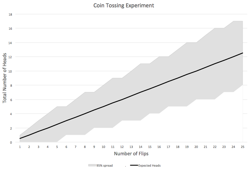
The man explains, “This diagram shows that at any given time, the expected number of Heads is equal to one-half of the total number of flips you’ve already done by that point. For example, after 8 flips, you would have expected to see a total of 4 Heads, which is why the black line goes through the point (8,4). Now the gray region is what statisticians call the ‘95% envelope’ surrounding the mean. So long as the actual observations of Heads fall within that envelope, then we can’t reject the hypothesis that it’s a fair coin. In contrast, if the observations did end up outside that shaded region, then we would be able to say, ‘There’s less than a 5% chance that these results could’ve occurred with a fair coin, so we’re pretty sure it’s not a fair coin.’ OK? Ready to take my coin for a test run?”
All of his remarks seem consistent with what you remember from your stats class. So you go ahead and flip the coin 25 times. He hands you a red Sharpie for you to mark the results on the paper as they occur. Specifically, you observe a Head on the 4th, 6th, 13th, 14th, 16th, 17th, 19th, 20th, and 21st tosses. The chart ends up looking like this:
Figure 2. Coin Tossing Experiment, With Results
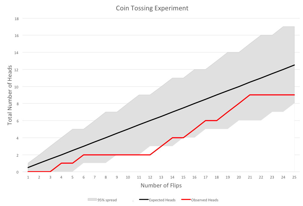
At this point, your Spidey Sense is tingling. During the trial, the coin was definitely “Head shy,” consistently falling below the expected number of Heads. Indeed, if you had stopped the trial after the 12th toss, the number of observed Heads at that point was so low that it fell outside the 95% envelope, and the red line hovered near that boundary for most of the other flips as well.
The carnival man can see your anxiety, and tries to reassure you by arguing, “What’s the problem? We have every reason to trust that this is a fair coin. Look: its performance has been well within the 95% spread.”
As you ponder the chart, you realize something: To say that the observed number of Heads “falls within the 95% envelope” does not mean, “We are 95% confident that this is a fair coin.” Rather, what it’s really saying is that if this were a fair coin, then the probability of it generating such a small number of Heads is at least 2.5%. (Note the decimal point: that’s two-and-a-half percent.) That is entirely a different claim, and one that—by itself—doesn’t inspire much confidence at all!
Now as I wrap up this tale, I don’t want to put the final words in your mouth. I just ask you, dear reader, whether you would take the carnival bet based on the above graph?
Now Looking at Climate Projections
The reason I walked through the long story above is that it illustrates a crucial concept: a 95% envelope or “spread,” showing how far observations can stray from the mean “expectation” value without us definitely rejecting the underlying model.
In the case of climate change, we aren’t testing whether a coin is fair, instead, we are testing whether a suite (or “ensemble”) of leading climate models gave accurate predictions of global temperature. So we use the computer models to generate their (averaged) mean projections of temperature, along with a 95% spread around the mean in order to account for the internal variability of the projections. (Even if you run the same computer simulation over and over with the same parameter settings, you will get different outputs.)
Then, after time passes, we can look at actual observations of global temperature, and plot them against the predictions. The following chart is taken from the RealClimate blog, which is one of the leading outposts giving “real climate scientists” (their term) a platform to give accurate information to the public. I stress that these folks are definitely part of the climate change orthodoxy, and are by no means “deniers” or even “skeptics.” With that in mind, look at the following chart that they themselves posted, in an evaluation of the climate models:
Figure 3. Climate Model Projections vs. Surface Observations, as of Feb. 2019
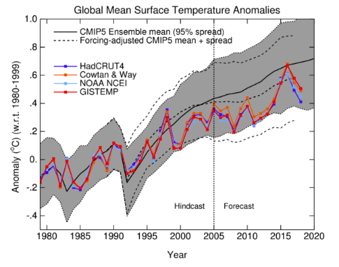
In Figure 3, the dark black line shows the mean global temperature prediction from an ensemble of leading climate models. (CMIP5 stands for Coupled Model Intercomparison Project, Phase 5; details are here.) The gray band is the 95% spread around the mean, accounting for the internal variability in the models.
The colored lines represent different series of global temperature observations. For example, the dark blue line represents HadCRUT4, the temperature dataset compiled by the Climatic Research Unit (CRUT) of the University of East Anglia, while the dark red line is GISTEMP, a global surface temperature dataset maintained by NASA.
Note that up to 2005, the models are giving a “hindcast”—meaning they were calibrated after these observations had been made. So the fact that the black line goes through the middle (roughly speaking) of the observations up through 2005 isn’t evidence of the models’ effectiveness.
The only true forecasts were made by these models from 2005 onward. And as we see, the observations are consistently below the mean of the model projections, with only one year on one dataset—namely, GISTEMP in 2016—actually hitting the model mean.
Furthermore, many of the other observations flirt with the lower edge of the 95% envelope, meaning that on those occasions, it would be correct to say, “If the climate models were a correct simulation of the actual climate, natural variation would give us such low observed temperatures just barely 2.5% of the time.”
Now if the surface temperature datasets are iffy, it’s really not even close with the satellite observations. The next figure is again taken from RealClimate:
Figure 4. Climate Model Projections vs. Satellite Observations, as of Feb. 2019
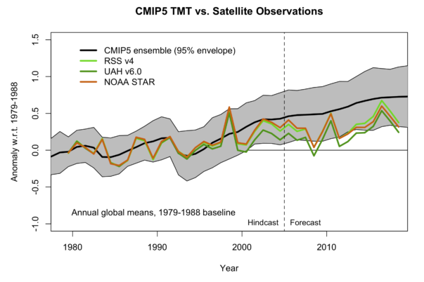
In Figure 4, we see that once we move into the genuine Forecast period, not a single data point in any of the three satellite series ever hit the mean projection of global temperature. Furthermore, as of the most recent observation, two out of three of the datasets lie below the 95% spread—and one of these series (UAH v6.0) spent much of the entire forecast period below the spread.
If the above results don’t make the establishment climate scientists admit to the public, “Yep, our models have been running hot, making projections of temperature increases that haven’t been observed,” then what would?
To repeat, Figures 3 and 4 are not taken from the Heartland Institute or Richard Lindzen’s website. Instead, they are taken from the people who think those figures vindicate the orthodox perspective on climate change. I invite the reader to peruse the relevant blog posts (here and here for an earlier, fuller discussion), where the RealClimate blogger interprets these charts. There really isn’t much commentary at all on the awkward satellite observations, and regarding the surface datasets, we are told that, “The current temperatures are well within the model envelope.”
Conclusion
In this post, I developed a long but hopefully intuitive fable about a carnival wager involving coin tosses. In that context, we saw quite clearly what it means for observations to “fall within the 95% spread,” even if they are flirting with its lower boundary.
There is an analogous situation with respect to the climate models. A few vocal scientists and many activists are pressuring political officials and the public to support massive tax hikes and new regulations in order to mitigate the threat of catastrophic climate change. Yet one of the crucial planks in their argument—namely, that we can trust the alarming computer simulations of global warming—rely on models that have clearly been overpredicting global temperature. The fact that the defenders of the orthodoxy won’t even acknowledge their own damning charts should give any honest citizen pause.
_________________________________
[1] Thanks to Derrick Reiner for helping me construct the two graphs illustrating the coin-flipping example.
