
Climate scientists Pat Michaels and Paul “Chip” Knappenberger have a very interesting Working Paper at Cato that evaluates a suite of popular computer models of the climate. As we will see, Michaels and Knappenberger demonstrate that the observed temperature trends are much lower than the average projections of the climate models. In fact, the actual temperature record is almost at the point of “rejecting” the climate models in the statistical sense.
“The Pause”: Real or Cherry-Picking?
The main purpose of this post is to show a key chart from the Cato paper. But in order for the reader to understand its significance, let me first review the controversy over the alleged “pause” in global warming.
What happened is that 1998 was an unusually warm year, with a global temperature spiking high above the 1997 value before falling back again in 1999. Therefore, the skeptics of alarmist climate change warnings were able to point out for many years afterward that global temperatures had ceased rising.
For example, this NASA GISS data set shows a global land-ocean temperature index. The annual value in the year 1998 was the same as in 2012. Thus, someone in 2012 could point out: “There has been no global warming in the last 14 years.”
However, critics argued that this was misleading, because (to repeat) it relied on the unusually large spike in temperatures in 1998. Only by cherry-picking the starting date, they argued, would it appear that there had been a “pause” or “hiatus” in global warming. If we looked at longer trends, starting at earlier dates, then (so the defenders of the orthodoxy claimed) we would see that the alarmist warnings were valid. (On the claim of “cherry-picking” on either side of the debate, see this post.)
Yes Virginia, the Models Have Overpredicted Warming
In this context, we are now prepared to understand the power of the results in the Cato paper. Below I reproduce one of their key results, which is Figure 2 in the paper. In the chart, the colored lines represent the trends of actual observations of various surface temperatures, while the dark black line shows the average temperature trend of 108 runs from popular climate models.
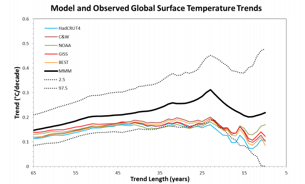
Figure 2. The annual average global surface temperatures from 108 individual CMIP5 climate model runs forced with historical (+ RCP4.5 since 2006) forcings were obtained from the KNMI Climate Explorer website. Linear trends were computed through the global temperatures from each run, ending in 2015 and beginning each year from 1951 through 2006. The trends for each period (ranging in length from 10 to 65 years) were averaged across all model runs (black line). The range containing 95 percent (dotted black lines) of trends from the 108 model runs is indicated. The observed linear trends for the same periods were calculated from the annual average global surface temperature record compiled by several different agencies described in the legend (colored lines) (the value for 2015 was estimated from January through October, average). [Diagram and description from Michaels and Knappenberger 2015.]
In the figure above, the y-axis measures the warming trend in units of Celsius degrees per decade. The x-axis measures the number of years during which a given trend is calculated, with 2015 always being the end-point of a particular trend.
For example, the blue line refers to the actual temperature observations in the HadCRUT4 data set. The blue line crosses the y-axis a little below the 0.12 notch (directly above 65 on the x-axis). This means that if we look at the HadCRUT4 data and calculate the linear trend over 65 years—i.e. starting in the year 1951 and ending in the year 2015—then there was a bit less than 0.12 degrees Celsius of warming per decade during those 65 years.
However, at the far right of the graph where the blue line ends, we are looking at the actual warming trend denoted in the HadCRUT4 data set only for a ten-year period, namely from 2006 to 2015.
The reason for constructing the chart in this fashion is that nobody can accuse Michaels and Knappenberger of cherry-picking starting years and (thus) trend durations. This chart contains information pertaining to the trend warming—both in the computer models and in the actual observations from several data sets—for any length, ranging from a 10-year trend all the way up to a 65-year trend, and all year lengths in between.
The Results?
To repeat: In the chart, the clustered colored lines are various data sets recording observed temperature trends. In contrast, the thick black line shows the average projected temperature trend generated by 108 climate model runs. Furthermore, the dotted black lines show the upper and lower “confidence intervals” for these model runs.
The idea here is that the computer models take account of the fact that temperature is variable, and so even if the model were “true” it couldn’t say precisely what the annual temperature would be at some future date, even knowing all of the relevant inputs such as greenhouse gas concentrations. Even so, the model can say things like, “The actual temperature will fall within this range with 95 percent confidence.” Thus the dotted black lines are showing the range in which the computer models thought the actual observations would fall, with 95 percent probability.
Put differently, if the computer models are “true,” then the actual temperature should fall below the bottom black dotted line only 2.5 percent of the time. Notice that the confidence band narrows as we move from right to left; in other words, the gap between the top and bottom dotted lines shrinks. This makes sense, because the trend length increases as we move from right to left. This happens because the computer models can’t be expected to nail down the global temperature for any specific year, but over longer and longer stretches, the natural volatility should somewhat “wash out” so that only the greenhouse forcings and other fundamental factors stand out.
Now as the chart clearly indicates, the actual observations (colored lines) are consistently below the climate models’ best guess (solid black line). In fact, the actual temperature readings are so far below the predicted warming that they flirt with the bottom confidence boundary.
Conclusion
Skeptics of climate change alarmism who periodically said, “There has been no global warming since 1998…” were telling the truth; the official records show that at various points—and as recently as 2012—the temperature was the same as it had been back in 1998.
However, defenders of the orthodoxy could understandably hit back and claim that this type of statement was misleading, since it relied on cherry-picking the start date of the trend at 1998, which was an unusually warm year.
In this context, we see how devastating the new Cato Working Paper is to the climate alarmists. Rather than getting bogged down in whether it is correct to speak of a “pause” in global warming, the more important critique points out how much less warming there has been, relative to the projections of the popular climate models.
The recent Cato Working Paper from Michaels and Knappenberger shows that no matter what starting date we use—going back to 1951—we find that the computer models have consistently overprojected warming. Indeed, their record is so bad that the popular climate models have at times been “rejected” by the actual observations in the statistical sense. The climate alarmists who claim that the popular computer models are in good shape either do not know what they’re talking about, or they are willfully misleading their readers.
